I Put Two AI Tools to the Test on the Same Task: Here's What I Learned
I had a PDF of workshop slides that needed to become a polished, accessible PowerPoint.
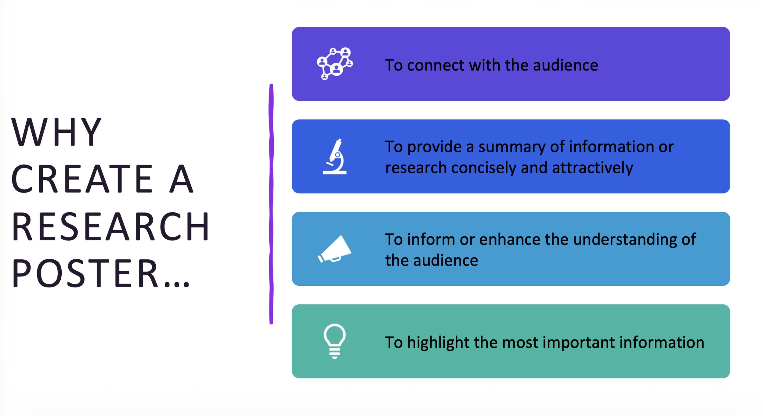
Instead of rebuilding it from scratch myself, I decided to test two different AI tools on the same task: Microsoft Copilot and Claude. Same source file. Same accessibility requirements. Very different results. Here is what happened with each one, what I learned from the comparison, and what it means for anyone using AI tools in their teaching and design workflows.
Part 1: What Happened with Microsoft Copilot
The Prompt
"Redesign this content into a PowerPoint presentation that is both aesthetically pleasing and strictly follows Section 508 Accessibility guidelines. Crucial Requirement for Titles: Every slide must use the official PowerPoint 'Title' placeholder for its heading. Do not use floating text boxes for slide titles. The title text must be visible in 'Outline View' to ensure screen readers can identify the slide's purpose. Layout & Design: > * Use the standard 'Title and Content' layout for all body slides. * Ensure a high contrast ratio between text and background. * Mark all decorative background elements or repetitive shapes as 'Decorative' within the file metadata. * Provide descriptive Alt Text for all functional icons or data-driven images. Please generate the .pptx file now using Indiana University's official palette.
What Copilot Did
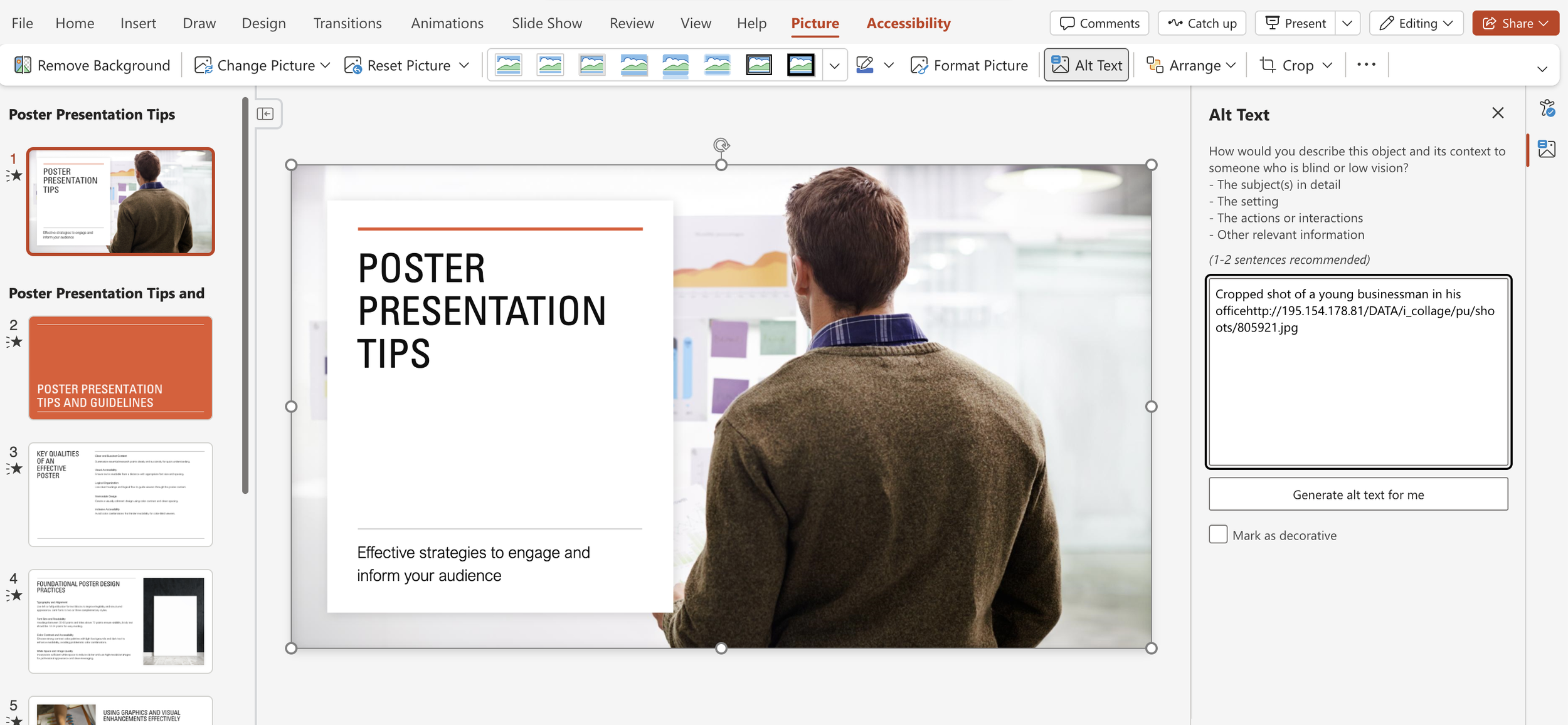
Behind the scenes, Copilot parsed the PDF content, performed a web search to pull IU's official hex codes (Crimson #990000 and Cream #EDEBEB from IU's branding resources), then built the slide deck using Python. The entire process, reading the prompt, searching for brand colors, parsing the PDF, generating the file, took only a few seconds.
That's the part that's genuinely impressive. A task that would take 30 to 60 minutes to complete manually, longer if you're applying accessibility standards carefully, was done almost instantly.
Where It Got Complicated
The IU colors were retrieved correctly, but they didn't fully appear in the slides. This is worth understanding because it's not a bug. It's an architectural limitation.
Copilot built the file programmatically, which means it set colors at the object level rather than through the slide master. No theme-level color changes, no branded backgrounds, no full visual overhaul. It also made a deliberate accessibility trade-off: IU Crimson as a background color risks low contrast with dark text, so Copilot defaulted to safer neutral styling instead. When accessibility and branding competed, it chose accessibility. That's technically the right call, even if the result isn't visually what you'd expect.
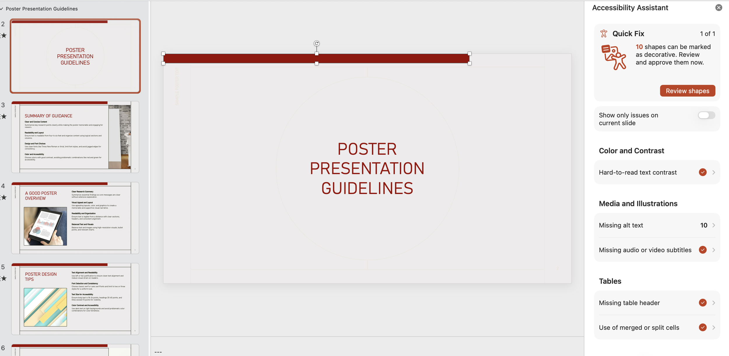
The takeaway is that understanding why Copilot made those choices matters just as much as knowing how to use the tool. The foundation was there and could be refined from that starting point. When I updated the prompt to have IU Colors integrated; it added crimson rectangles that had to be tagged as decorative images. Click Iu_poster_tips.pptx to see the slide deck.
Part 2: What Happened with Claude
The Prompt
I uploaded the same PDF and gave Claude a single instruction:
"Redesign this so that it is a PowerPoint that is aesthetically pleasing and meets Accessibility guidelines as defined by Section 508 of the Rehabilitation Act." Then I waited. (NOTE: If you choose to use Claude to create a PowerPoint, make sure it is not being used for content that contains sensitive material such as student data, etc.)
What Claude Did
Click title_abstract_writing_accessible_v2 1.pptx to see the slide deck.
Within about two minutes, Claude read all 16 pages of content, selected a cohesive teal and gold color palette, and rebuilt all 13 slides from scratch as a fully formatted .pptx file, complete with icon cards, numbered sections, a title slide, and consistent layouts throughout.
Honestly, I liked what it produced. The design was clean, intentional, and visually stronger than the original PDF. The color choices were bold but readable, the layouts were structured, and it felt like something I would actually use in a workshop setting.
The Process and the Gotchas
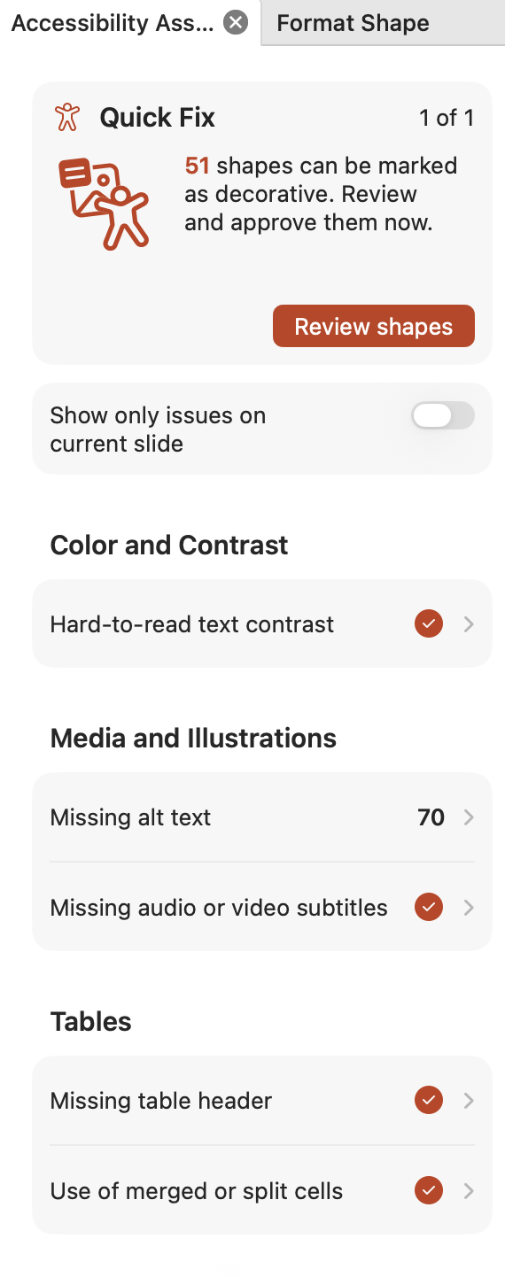
After reviewing the slides, I made one follow-up request: mark any shapes that weren't icons as decorative. Claude updated the file. But when I opened the PowerPoint and ran the built-in Accessibility Checker, it flagged 125 items still needing attention.
Sample Accessibility Assistant
All 125 items were decorative shapes: squares, rectangles, and design elements that carry no content meaning. Claude's update had been a step in the right direction, but PowerPoint's built-in checker caught what remained.
The fix itself was fast. I clicked through the flagged items, identified which six were actual images needing alt text, wrote descriptions for those, and let PowerPoint automatically mark the remaining 119 as decorative. Less than a minute of cleanup.
One More Snag: The Title Compliance Issue
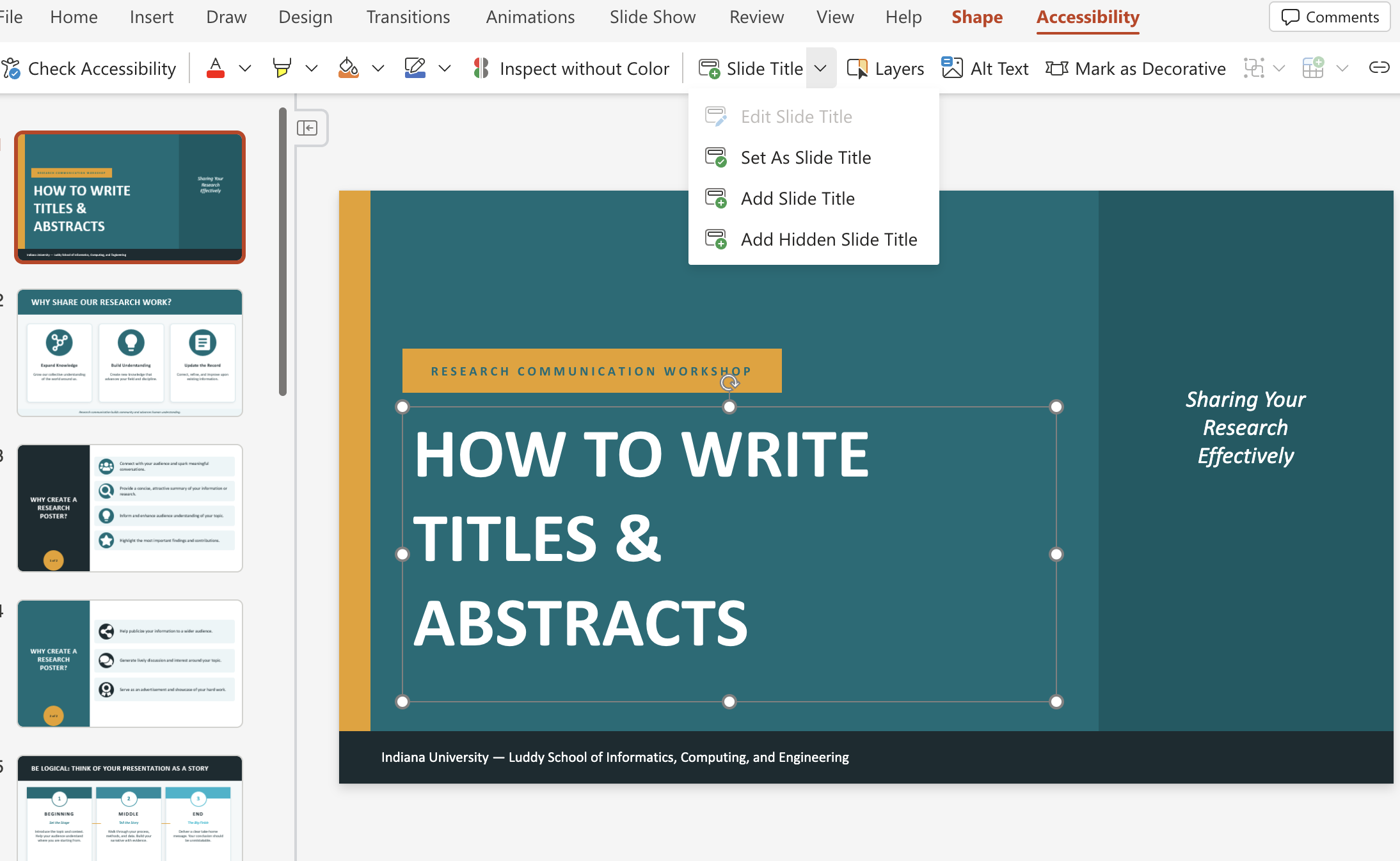
When I uploaded the finished file to Microsoft 365 and ran the Accessibility Checker again, my titles were flagged as non-compliant. The issue? Claude had used floating text boxes instead of official PowerPoint placeholder elements. The Accessibility Checker didn't recognize them as proper slide titles.
To fix it properly, I rebuilt the presentation using python-pptx, which let me force the use of Title and Content and Title Slide layouts assigning each title a proper placeholder identifier the Accessibility Checker actually recognizes. I also resolved a z-order issue where background design elements were occasionally rendering on top of the text.
I'm currently working on translating this coding-based fix back into a simple prompt-based workflow for anyone who doesn't want to touch Python. I'll share that when I have it worked out.
Putting It Together: What the Comparison Reveals
Both tools got me to a usable, accessible PowerPoint faster than I could have done it manually. But they got there differently, and those differences matter depending on what you're trying to accomplish.
Copilot is fast, integrated directly into Microsoft 365, and appropriately cautious. It prioritized accessibility compliance over branding, which is technically correct even if the visual result felt incomplete. If you're working within a campus ecosystem where Microsoft tools are the standard, Copilot is a solid starting point; just go in knowing you'll likely need to refine the visual branding manually afterward.
Claude made bolder design choices and produced a more visually polished output from a single prompt. The teal and gold palette, the icon cards, the numbered sections; those were all Claude's decisions, and they were good ones. The accessibility gaps it left behind were real but fixable in minutes using PowerPoint's own tools.
Neither tool alone was the complete solution. Both made changes to the original text. In this case it was an improvement, but you should check to make sure your text retains your intended meaning. Together AI generation followed by a quick accessibility checker review. The process that would have taken hours manually was done in under 10 minutes.
The Practical Takeaway
Running the accessibility checker at the end should be standard practice regardless of what tool you use to generate your file. Think of it as a spell check for inclusion. The checker doesn't just catch AI mistakes; it catches human ones too. Build it into your workflow and it becomes fast and routine.
AI tools are genuinely useful for this kind of work. They're not plug-and-play replacements for design judgment or accessibility expertise, but they dramatically lower the time cost of getting to a first draft that's already doing most of the right things. That's worth paying attention to

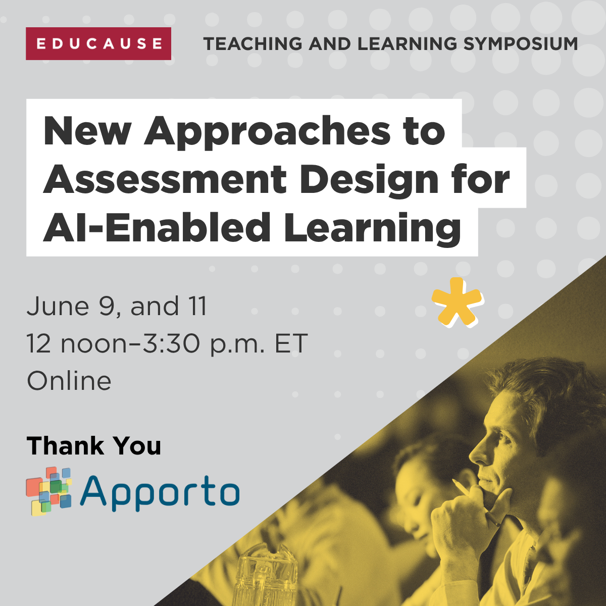

Quick Post - What Would It Look Like to Love Our Students Into Computing?
Reflections on the SIGCSE TS 2026 Keynote: Love, Learning, and Computing Education
The Pipeline Isn't Neutral
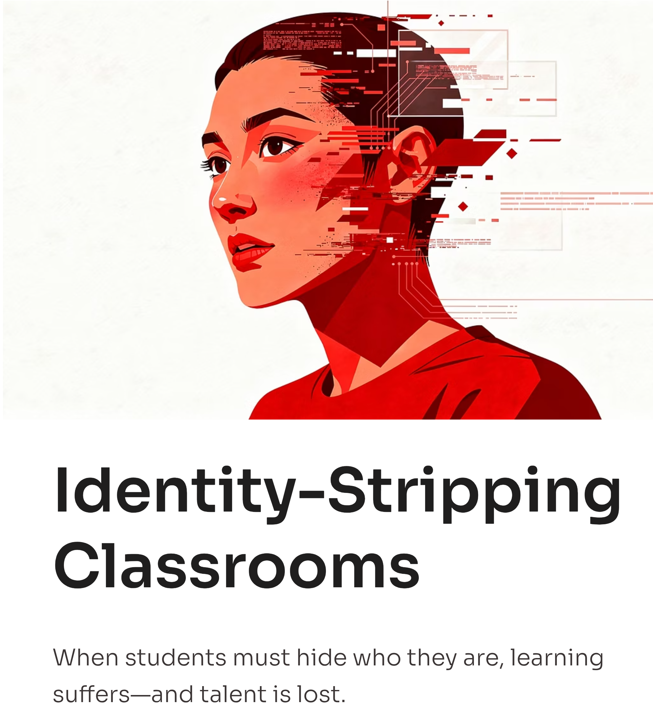
Traditional computing education often uses a "pipeline" metaphor, focusing on attracting and retaining students for technical careers. However, this approach overlooks crucial aspects like meaningful journeys, student belonging, and inclusivity. The keynote advocates for identity-affirming care in computing education. When students can fully engage, they contribute in ways that narrow, identity-stripping classrooms cannot foster.
"Whatever Love" in Practice
The keynote highlights practical examples of this philosophy:
Kapor Center's Culturally Responsive-Sustaining CS Education Framework: This framework redefines equity-centered computing, viewing students' cultural backgrounds as assets rather than obstacles.
Ricarose Roque's work on family and community-centered computing: Projects like Family Creative Learning demonstrate that designing for connection and joy opens computing to a broader audience, leading to a different kind of rigor.
Kylie Peppler's scholarship on tools and materials: Peppler's research shows that educational materials are not neutral; they carry cultural histories and implicit messages about belonging. Arts-integrated toolkits can broaden participation and improve learning outcomes.
Jayne Everson's ICER 2025 paper, Dreaming of Difference: This paper emphasizes student voice, revealing that secondary students desire distributed accountability, autonomy, community, and collaboration. They seek a redefined rigor that acknowledges their whole selves.
Mara Kirdani-Ryan's dissertation on Identity Fragmentation: This work addresses the feeling students have of needing to suppress parts of their identity to fit into CS, identifying it as an environmental issue, not a student problem.
Adrienne Gifford's work on language, culture, and CS classroom practice: Gifford's projects, such as Wordplay, illustrate how valuing students' linguistic and cultural identities as intellectual resources can transform research and teaching.
Implications for Learning Design
For those in computing education, the keynote prompts a critical self-assessment: Do our choices in courses, assessments, language, and tools affirm student belonging? This has direct implications for:
Authentic assessment in the age of generative AI: Process-oriented evaluation, portfolio work, and student involvement in assessment design are acts of dignity, valuing how students think, not just what they produce.
Faculty development: Educators must understand that their choices are not neutral; they either affirm or diminish students.
AI in education: The tools we integrate are not neutral actors. "Whatever love" demands interrogating their underlying assumptions before introducing them to students.
A Different Kind of Rigor
The keynote doesn't ask us to lower our standards. It asks us to raise them — to hold ourselves to a higher standard of care, design, and accountability to the people we serve.
What would it mean to design a CS course as an act of love? Not love as sentimentality, but love as Roque and Peppler and Everson and Gifford are practicing it: grounded in evidence, committed to dignity, willing to be uncomfortable in service of something better.
I think that's the question worth sitting with.
Want to explore these ideas further? Watch the full SIGCSE TS 2026 keynote on YouTube, and dig into the scholars cited: the Kapor Center's CS Education Framework, Ricarose Roque's work, Kylie Peppler's research, and Jayne Everson's ICER 2025 paper.
Feedback Playbook for Technical Courses

Feedback that Works!
Where am I going? How am I doing? What’s next?
By this point in the semester, the honeymoon is over. Students have hit their first complex coding project, circuit simulation, or data analysis lab, and many of them are hitting a wall. The feedback you give at this moment does real work. It shapes confidence, persistence, and students’ internal sense of what quality looks like in your discipline.
In technical disciplines, “good job” isn’t enough, and “wrong” is frustrating without context. Research tells us that feedback is most effective when it’s specific, timely, and actionable (Shute, 2008). But in STEM courses, we also need it to be efficient for you as a faculty member with several responsibilities, and accessible across a wide array of learner backgrounds. So, here’s how to provide high-impact feedback without losing your entire weekend to the grading pile.
This post focuses on how to use rubrics, short screencasts, and carefully chosen AI tools to deliver feedback that is specific, humane, and sustainable without turning grading into a second job.
In computing, engineering, and data-focused courses, the first major assignment is often the point where students encounter professional-level complexity for the first time. Many report that feedback feels generic, delayed, or disconnected from how they can improve. In programming courses in particular, feedback frequently centers on whether something works, rather than how well it is designed, documented, tested, or maintained (Hundhausen et al., 2013; Keuning et al., 2018). Research consistently shows that feedback is most powerful when it helps students answer four questions: Where am I going? How am I doing? Where to next? What strategies will help me improve? (Hattie & Timperley, 2007). Other work shows that students also need support to actively engage with feedback, not just receive it, for it to influence learning (Winstone et al., 2017).
The goal is to structure feedback so students can answer those questions for themselves while keeping your workload manageable.
Strategy 1: Make Rubrics Do the Heavy Lifting
Well-designed rubrics turn vague judgment into transparent expectations. When rubrics include descriptive performance levels and are shared before students begin the work, they improve learning outcomes and student satisfaction (Reddy & Andrade, 2010; Andrade & Du, 2007). In technical courses, rubrics also make implicit professional norms visible, assessable, and discussable (Winkelmes et al., 2016).
Common rubric problems in technical disciplines include broad categories like “Code Quality: 0–25 points,” binary “works or doesn’t work” distinctions, and descriptors such as “good documentation” without observable indicators. These approaches provide little guidance for improvement and often lead to repetitive instructor commenting (Nicol & Macfarlane-Dick, 2006).
A stronger rubric distinguishes performance levels for criteria such as code organization, error handling, testing, documentation, security practices, and version control. For example, exemplary error handling might include meaningful user messages, logging, and graceful failure, while beginning-level work might include crashes, unhandled input, and no diagnostics.
Three moves you can implement right now:
Align each rubric criterion with a specific learning objective and an authentic professional practice such as test coverage, branching strategy, or secure queries (Winkelmes et al., 2016).
Share the rubric when you assign the work and ask students to self-assess against it before submission. This supports metacognition and improves performance (Andrade & Du, 2007; Nicol & Macfarlane-Dick, 2006).
In advanced courses, co-create parts of the rubric by asking students what distinguishes novice work from expert work. This builds agency and self-regulation (Winstone & Carless, 2020).
When rubrics are doing real instructional work, they reduce repetitive commenting and anchor feedback in shared language.
Strategy 2: 120-Second Over-the-Shoulder Screencast Reviews
Some problems are just inefficient to explain in text. A subtle logic error, a flawed circuit diagram, or a misapplied data transformation is often easier to show than describe. Research on multimedia learning shows that concise audio-visual explanations improve understanding for procedural and spatial tasks (Mayer, 2014) and increase students’ sense of instructor presence (Borup et al., 2013).
Here’s a practical pattern: the 120-second over-the-shoulder review.
Open the student’s code or artifact. Start a quick screencast using a tool (like Adobe Express, Kaltura or Zoom). Spend two focused minutes highlighting strengths and one to three priority issues.
What this sounds like:
“I see what you’re doing here on line 42. You’re reinitializing the counter inside the loop, which is why it never increments. Watch what happens when I move it above the loop.”
Or:
“When debugging, trace variable values step by step instead of changing multiple things at once. That process will help you isolate the break.”
Frame your comments at three levels:
Task: what is happening and why it is incorrect.
Process: strategies the student can reuse in future work.
Self-regulation: reinforcement of productive approaches they are already using.
Avoid feedback about personal traits. Research shows that praise focused on the self has little impact on learning (Hattie & Timperley, 2007). Short screencasts allow students to see expert reasoning in action and have been linked to increased engagement and improved code quality in computing courses (Cavalcanti et al., 2021; Hundhausen et al., 2013).
If grading in Canvas, consider using its built-in Video Feedback feature to keep everything in one place:
Strategy 3: Tiered Feedback So You Don’t Burn Out
Not every student needs the same type or depth of feedback. Research on formative assessment suggests that differentiated feedback can be both more effective and more sustainable for instructors (Shute, 2008; Winstone & Carless, 2020).
For a class of about 30 students, a realistic model looks like this:
Top 20 percent: Brief text comments highlighting exemplary practices and optional stretch ideas. Time per student: two to three minutes.
Middle 60 percent: Five- to seven-minute screencasts focused on two or three rubric criteria that would move the work to the next level.
Bottom 20 percent: Five- to seven-minute screencast plus an invitation to meet, emphasizing growth and support rather than penalty.
This typically adds up to about three hours of feedback time, comparable to detailed written comments but with higher instructional payoff (Ice et al., 2007).
Efficiency improves further if you create two or three short videos addressing common issues and link them instead of repeating the same explanations student by student (Borup et al., 2013).
Adapting Strategy 3 for large-enrollment courses (e.g., 100+ students) requires shifting from individual tiering to collective and automated tiering. While individual screencasts are sustainable for 30 students, they become a “second job” for 150.
Here is how to scale the tiered feedback model without losing the instructional payoff:
The Scaled Tiered Model
In a large course, you can replace individual screencasts with “Problem-Set Debriefs” and automated triggers.
Top Tier (High Achievers): Use automated “Success” triggers. In platforms like Canvas or Gradescope, you can set a rule that students scoring above 90% receive a pre-written comment praising their specific mastery and providing “stretch” links to advanced professional documentation or extra-credit challenges.
Middle Tier (The “Global” Feedback): Instead of individual videos, record three 2-minute “Common Pitfall” screencasts based on the most frequent errors identified during grading. Link these videos directly in the rubric or assignment comments so students can see expert reasoning for the specific logic errors they likely encountered.
Bottom Tier (High Support): Identify students who failed to meet core learning objectives and send a templated, supportive “Check-in” message through the Student Engagement Roster. Invite them to a group “Office Hour Lab” specifically designed to review the foundational concepts they missed, emphasizing growth over penalty.
Strategy 4: Thoughtful Use of AI for Feedback and Grading
AI tools (such as Gradescope) can reduce routine grading work and provide fast correctness feedback, but they are not substitutes for professional judgment. Research shows that automated systems are effective at identifying syntax errors, style violations, and common mistakes, but struggle with design quality, documentation, and nuanced reasoning (Keuning et al., 2018).
Use AI or automated tools to:
Run test suites and identify edge cases. Enforce style and basic security rules. Provide immediate, low-stakes feedback for iteration.
Reserve human review for:
Architecture and design choices. Maintainability and documentation. Security practices and professional conventions.
To keep this ethical and transparent:
Clearly label which rubric criteria are auto-scored and which are human-scored (Holmes et al., 2022). Provide a process for students to request review when automated feedback seems incorrect. Periodically audit AI-assisted scoring for bias or uneven impact (Baker & Hawn, 2021).
You can also frame AI as a learning partner rather than a grader by asking students to document how they used AI tools, rewarding reflective use, and setting clear boundaries around generated content (Kasneci et al., 2023).
Your Implementation Checklist
If you want a minimal, high-impact plan:
Finalize and share a detailed rubric aligned with professional practices (Reddy & Andrade, 2010). Require a brief student self-assessment using the rubric (Andrade & Du, 2007). Set up one reliable screencasting workflow and practice a short review (Mayer, 2014). Plan a tiered feedback scheme so your time is targeted (Shute, 2008). Create two or three short videos for common issues. Clearly explain how automated tools are used and how students can respond (Holmes et al., 2022). Reserve support time for students who are still developing core skills (Kuh, 2008; Winstone et al., 2017).
When feedback shows students what quality looks like, helps them see where they are, and gives them clear next steps, assessment becomes part of learning rather than an endpoint. In technical disciplines, that shift often determines whether students decide they don’t belong or begin to see themselves as capable, growing professionals.
References
Andrade, H., & Du, Y. (2007). Student responses to criteria-referenced self-assessment. Assessment & Evaluation in Higher Education, 32(2), 159–181. https://doi.org/10.1080/02602930600801928
Baker, R. S., & Hawn, A. (2021). Algorithmic bias in education. International Journal of Artificial Intelligence in Education, 32(4), 1052–1092. https://doi.org/10.1007/s40593-021-00285-9
Borup, J., West, R. E., & Graham, C. R. (2013). The influence of asynchronous video communication on learner social presence: A narrative analysis of four cases. Distance Education, 34(1), 48–63. https://doi.org/10.1080/01587919.2013.770427
Cavalcanti, A. P., Barbosa, A., Carvalho, R., Freitas, F., Tsai, Y.-S., Gašević, D., & Mello, R. F. (2021). Automatic feedback in online learning environments: A systematic literature review. Computers and Education: Artificial Intelligence, 2, Article 100027. https://doi.org/10.1016/j.caeai.2021.100027
Hattie, J., & Timperley, H. (2007). The power of feedback. Review of Educational Research, 77(1), 81–112. https://doi.org/10.3102/003465430298487
Holmes, W., Porayska-Pomsta, K., Holstein, K., et al. (2022). Ethics of AI in education: Towards a community-wide framework. International Journal of Artificial Intelligence in Education, 32(3), 504–526. https://doi.org/10.1007/s40593-021-00239-1
Hundhausen, C. D., Agrawal, A., & Agarwal, P. (2013). Talking about code: Integrating pedagogical code reviews into early computing courses. ACM Transactions on Computing Education, 13(3), Article 14. https://doi.org/10.1145/2499947.2499951
Ice, P., Curtis, R., Phillips, P., & Wells, J. (2007). Using asynchronous audio feedback to enhance teaching presence and students’ sense of community. Journal of Asynchronous Learning Networks, 11(2), 3–25. https://doi.org/10.24059/olj.v11i2.1724
Kasneci, E., Seßler, K., Küchemann, S., et al. (2023). ChatGPT for good? On opportunities and challenges of large language models for education. Learning and Individual Differences, 103, Article 102274. https://doi.org/10.1016/j.lindif.2023.102274
Keuning, H., Jeuring, J., & Heeren, B. (2018). A systematic literature review of automated feedback generation for programming exercises. ACM Transactions on Computing Education, 19(1), Article 3. https://doi.org/10.1145/3231711
Kuh, G. D. (2008). High-impact educational practices: What they are, who has access to them, and why they matter. AAC&U. https://www.aacu.org/trending-topics/high-impact
Mayer, R. E. (2014). Cognitive theory of multimedia learning. In R. E. Mayer (Ed.), The Cambridge handbook of multimedia learning (2nd ed., pp. 43–71). Cambridge University Press. https://doi.org/10.1017/CBO9781139547369.005
Nicol, D., & Macfarlane-Dick, D. (2006). Formative assessment and self-regulated learning: A model and seven principles of good feedback practice. Studies in Higher Education, 31(2), 199–218. https://doi.org/10.1080/03075070600572090
Reddy, Y. M., & Andrade, H. (2010). A review of rubric use in higher education. Assessment & Evaluation in Higher Education, 35(4), 435–448. https://doi.org/10.1080/02602930902862859
Shute, V. J. (2008). Focus on formative feedback. Review of Educational Research, 78(1), 153–189. https://doi.org/10.3102/0034654307313795
Winkelmes, M. A., Boye, A., & Tapp, S. (2016). Transparent design in higher education teaching and leadership. Stylus. https://www.routledge.com/Transparent-Design-in-Higher-Education-Teaching-and-Leadership-A-Guide-to-Implementing-the-Transparency-Framework-Institution-Wide-to-Improv/Winkelmes-Boye-Tapp/p/book/9781620368237 IUCAT https://iucat.iu.edu/catalog/20508845
Winstone, N. E., & Carless, D. (2020). Designing effective feedback processes in higher education. Routledge. https://www.routledge.com/Designing-Effective-Feedback-Processes-in-Higher-Education-A-Learning-Focused-Approach/Winstone-Carless/p/book/9780815361633 IUCAT – https://iucat.iu.edu/catalog/20522170
Winstone, N. E., Nash, R. A., Parker, M., & Rowntree, J. (2017). Supporting learners’ agentic engagement with feedback: A systematic review and a taxonomy of recipience processes. Educational Psychologist, 52(1), 17–37. https://doi.org/10.1080/00461520.2016.1207538
SIGCSE Grant Award
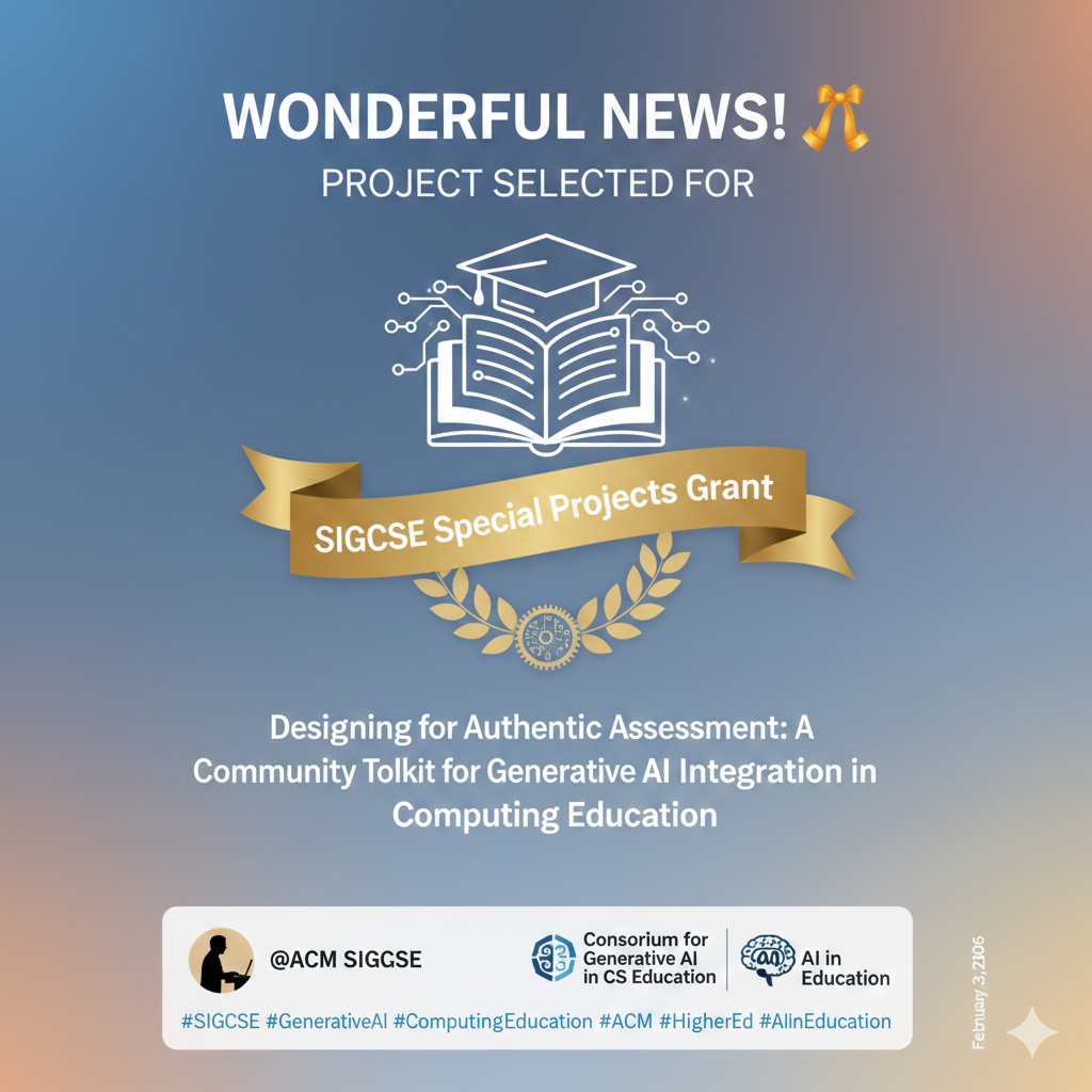
Excited to share some wonderful news!
My proposal, "Designing for Authentic Assessment: A Community Toolkit for Generative AI Integration in Computing Education," has been selected to receive a SIGCSE Special Projects grant through @ACM SIGCSE!
I designed this project because I believe we need better frameworks for how we assess student learning in the age of generative AI, not just how we use it. The real challenge in computing education right now isn't adopting AI tools. It's ensuring that students are still developing authentic understanding and critical thinking skills alongside them. This toolkit is my attempt to give educators practical, community-driven resources to do exactly that.
The funding is being allocated through the Consortium for Generative AI in CS Education, a community that is giving this conversation the momentum it deserves.
Proud to be doing this work, and looking forward to seeing what this toolkit becomes.
RECRUITMENT WILL START SOON
If you're working on similar challenges in computing education, I'd love to connect!Learn more about the Consortium for Generative AI in CS Education here: https://teachcswithai.org
#SIGCSE #GenerativeAI #ComputingEducation #ACM #HigherEd #AIinEducation
2026 IU Generative AI Faculty Fellow!

Excited to share that I've joined the Generative AI Faculty Fellows Program!
This opportunity comes at the perfect time. Rather than acquiring more knowledge about AI, I'm now focused on applying what I know to transform teaching and learning in meaningful ways.
The fellowship brings together colleagues committed to ethical, pedagogically-sound AI integration. I'm particularly energized by the collaborative aspect—working alongside peers who understand both the transformative potential and the responsibility that comes with these tools.
My focus? Building systems that enhance student learning while maintaining critical awareness of AI's broader implications. This is about action, not just information.
For those who've followed my recent shift from "just one more course" to actually building: this is what application looks like. And I'm here for it!
Looking forward to sharing what we create together.
#HigherEd #FacultyDevelopment #TeachingAndLearning #GenAI #IU #FacultyFellows #GenAIFacultyFellows #AIInEducation #TeachingInnovation