In a previous post, I walked through Fink’s Taxonomy of Significant Learning and argued that the dimensions most resistant to AI offloading are Human Dimension, Caring, and Learning How to Learn. If you have not read that post yet, it is worth starting there. This post picks up where that one left off.
Knowing which dimensions to target is necessary. The harder question is this: once you have redesigned an assignment to require Integration, Caring or Learning How to Learn, how do you actually know whether the student’s thinking got there? How do you make that thinking visible, not just to yourself, but to the student?
Why Thinking Must Be Seen
Let me start with an honest admission. Long before AI arrived, most of us were already assessing products and hoping the thinking happened somewhere in the middle.
A student submits a system design proposal. We grade the proposal. But did the student genuinely wrestle with tradeoffs? Did they consider the user population? Did they revise their mental model partway through? We have no idea, because the process was invisible to us.
Bransford’s foundational work on how people learn keeps returning to the same finding: learning is the result of thinking, not the result of submitting. Students arrive with preconceptions already formed. If we do not actively engage those preconceptions, new information slides off. They perform for the test and revert to old models the moment the course ends.
AI has not created this problem. It has simply removed our excuse for not solving it.
When a student can generate a convincing network architecture diagram in thirty seconds, or produce a well-structured post-mortem without ever having reflected on anything, the gap between product and thinking becomes impossible to ignore. The question is no longer “did the student submit something good?” It is “did the student actually think?”
Eight Thinking Moves That Matter
Ron Ritchhart, Mark Church, and Karin Morrison spent years researching what happens in classrooms where deep learning consistently occurs. Their conclusion, documented in Making Thinking Visible, is that those classrooms share one quality: the teachers have found ways to make the thinking process explicit, observable, and routine.
They identify eight types of thinking that matter most in deep learning:
Observing closely and describing what is there
Building explanations and interpretations
Reasoning with evidence
Making connections
Considering different viewpoints and perspectives
Capturing the heart and forming conclusions
Wondering and asking questions
Uncovering complexity and going below the surface
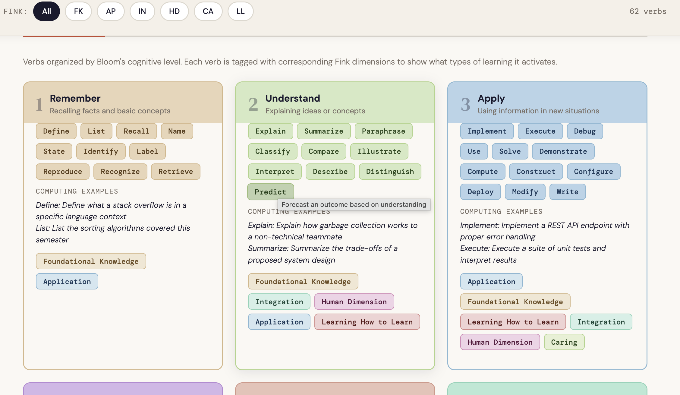
Read that list through the lens of Fink’s dimensions. Making connections is Integration made visible. Wondering and asking questions is Learning How to Learn in action. Considering different viewpoints is Human Dimension surfacing in real time. Capturing the heart and forming conclusions is Caring given a concrete form.
🗂️
Interactive chart To see the full picture of how each thinking type maps to Fink’s dimensions, explore the Fink-Ritchhart Connection Chart. Hover over any card to see which dimensions a thinking type activates and why the connection exists. It is a practical audit tool to keep open when you are reviewing an assignment or selecting a routine.
→ Open the Fink-Ritchhart Connection Chart
Fink tells us which dimensions produce significant learning. Ritchhart gives us the thinking moves that actually get students there.
The bridge between them is the thinking routine: a short, structured, repeatable cognitive scaffold that makes the reasoning process visible to both the instructor and the student, before, during, or after an assignment. The key word is repeatable. A thinking routine used once is an activity. Used consistently, it becomes a habit of mind.
What It Looks Like in Practice
The most common objection I hear from computing faculty is that thinking routines feel like they belong in a humanities classroom. They do not. Here is what they look like in technical contexts, alongside what an AI-generated response to the same prompt would typically produce.
Connect-Extend-Challenge in a Cybersecurity Course
After students analyze a new class of vulnerabilities, rather than simply asking them to summarize what they learned, ask three questions: What connections do you see between this attack surface and techniques you have encountered before? How does it extend your mental model of how systems fail? What does it challenge in your current assumptions about secure design?
🎯 Fink dimension:Integration
What AI output looks like: A fluent, well-organized paragraph connecting the vulnerability class to common attack taxonomies, citing OWASP or MITRE ATT&CK — with no personal frame of reference and no indication of cognitive struggle or surprise.
What authentic visible thinking looks like: A response that names a specific system or course context the student is connecting to, identifies a genuine point of confusion or revision in their thinking, and asks a follow-up question they actually want answered.
Think-Puzzle-Explore Before a Systems Design Assignment
Before students begin a major design task — architecting a distributed data pipeline or specifying a real-time embedded system — ask them to spend ten minutes on three prompts: What do you already think you know about this problem space? What puzzles you about it? What would you want to explore before committing to a design direction?
🎯 Fink dimension:Learning How to Learn
What AI output looks likeA generic overview of the problem domain, a list of standard considerations (latency, fault tolerance, scalability), and a suggested exploration path drawn from documentation.
What authentic visible thinking looks likeIdiosyncratic puzzles specific to this student’s prior experience, honest uncertainty about where to start, and questions that reflect what they personally do not yet understand rather than what the internet says is hard.
I Used to Think / Now I Think at Project Completion
At the end of a software engineering project, before students submit their final documentation, ask them to complete two sentences: “I used to think [X] about [the problem, the technology, the team process]” and “Now I think [Y].” Require them to explain what changed their thinking.
🎯 Fink dimensions: Caring&Learning How to Learn
What AI output looks like: A polished reflection arc that describes growth in general terms, references course concepts correctly, and lands on a tidy conclusion about professional development.
What authentic visible thinking looks likeSomething specific — a named moment in the project where a decision backfired, a teammate conversation that reframed the problem, a line of code that revealed a misunderstanding the student did not know they had. Specificity is the signal.
Design Principle: Assess the Process
When you cannot assess the thinking directly, make the process the assessment.
This does not mean adding reflection questions as an afterthought. It means designing the assignment so that the thinking process is where the grade actually lives.
In an introductory programming course, this might mean asking students to annotate their code not with what it does but with why they made the choices they made. Not “initialize array here” but “I chose an array over a linked list because access patterns here are random and I wanted O(1) lookup, but I am not sure this holds if the input size grows.” That annotation is a window into reasoning that the code itself cannot provide.
In a networking or operating systems course, it might mean asking students to document their debugging process rather than just their solution. What did they try first? What did that tell them? What did they have to revise? The process log is where the learning lives. The solution is just evidence that the process concluded.
In a capstone or project course, it might mean maintaining a design decision log throughout the semester. Every significant choice — whether architecture, data model, technology selection, or tradeoff resolution — gets a brief written rationale. When students defend their work at the end of the semester, they are not reconstructing decisions from memory. They are curating a record of their own thinking.
AI and the Cost of Offloading
I want to name this clearly because it gets lost in conversations about academic integrity.
The concern with AI offloading is not primarily that students are cheating. It is that they are forfeiting the experiences that produce the outcomes we most care about.
A student who uses AI to generate their debugging rationale has not practiced the metacognitive regulation that Fink’s Learning How to Learn dimension is built on. They have not developed the habit of monitoring their own understanding and adjusting. They have not had the experience of being genuinely stuck and finding their way through. That experience is not a side effect of learning computing. It is the mechanism by which computing is learned.
⚠️
When we assign AI without designing for visible thinking, we are not just making assessment harder. We are removing the conditions under which the most durable and significant learning occurs.
Getting Started: Three Design Questions
Before assigning any major project, ask yourself three questions.
🧭
1. What thinking do I actually want to see?Name the specific thinking moves from Ritchhart’s list that the assignment should require. Use the Fink-Ritchhart chart to check which Fink dimensions those moves activate. If Human Dimension, Caring, or Learning How to Learn are absent, you have identified your highest-risk area for offloading.
2. Where will that thinking show up in the student’s work?If the answer is “in the final product,” reconsider the design. The final product is where AI performs best. The thinking needs a dedicated, structured space: a routine checkpoint, an annotation layer, a decision log, an oral defense.
3. How will you know it is genuine?Look for specificity. Genuine thinking produces idiosyncratic responses: a named moment of confusion, a connection no one else in the class would make, a question that only makes sense given this student’s prior experience. Generic fluency is the signal that the thinking may have been skipped.
Use the Project Zero Thinking Routine Toolbox to select a routine that fits your course context. It is free, searchable by purpose, and includes facilitation guidance. In most cases, a well-chosen routine adds less than fifteen minutes to the student’s workload and gives you far more information than the artifact alone.
📥
Free resources to go with this post
Fink-Ritchhart Interactive Chart — hover and filter to audit any assignment
Connect-Extend-Challenge Template — discipline-specific prompts for CS, engineering, and HCI
Process Depth Rubric — for assessing how students think, not just what they submit
The goal is not to make every assignment a reflection exercise. It is to build enough visibility into your course design that you can actually see whether the learning you care about is happening.
Because if you cannot see the thinking, you cannot teach it.
And in the age of AI, if you cannot see it, your students may have already learned to skip it.
What thinking routines are you already using in your courses, or curious about adapting for a technical context? Share your approach or questions in the comments.
